Where it all began
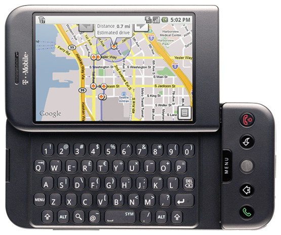
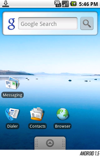
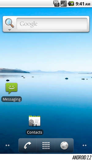
The Android era officially began on October 22nd, 2008, when the T-Mobile G1launched in the United States. Initially, many features that we couldn't live without today were missing — an on-screen keyboard, multitouch capability, and paid apps, for instance — but the foundation was in place, and a few lasting trademarks of the platform debuted on those very first G1s to roll off the assembly line:
The pull-down notification window. Though these early phones clearly weren't without their flaws, it was almost universally acknowledged that Android nailed the notification system on day one — it would take iOS another three years before launching a design as effective at triaging messages and alerts coming from users' ever-growing collection of mobile apps. The secret was in the G1's unique status bar, which could be dragged downward to reveal every notification in a single list: text messages, voicemails, alarms, and so on. The fundamental concept lives on (in a refined form) even in version 4.0 today.
Home screen widgets. If you had to pick an enduring differentiator for Android as a phone platform — a differentiator it can still claim against iOS 5 and, to some extent, Windows Phone 7.5 — it'd be rich support for widgets on the home screen. Google had big plans for widgets from the very beginning, but there was one big hang-up at launch: developers couldn't create their own widgets.
Deep, rich Gmail integration. By the time the G1 was released, Gmail had long since supported POP and IMAP for integration with mobile email clients — but the problem is that neither one of those protocols are well-suited for supporting some of Gmail's more unique features like archival and labeling. Android 1.0 fixed that in a big way, shipping with by far the best mobile Gmail experience on the market.
The Android Market. It's hard to imagine a smartphone without a centralized app store now, but when Android first shipped, it did so at the very start of the mobile app revolution. Indeed, the Android Market on those first G1s bore little resemblance to the Android Market of today: it launched with just a handful of apps (as you'd expect of an entirely new ecosystem), and didn't have the rich, multifaceted curation that has been added over the last couple versions — instead, it just had a single row of handpicked selections at the top of the app's home screen. Perhaps more importantly, it lacked support for any sort of payment system, a problem that wouldn't get fixed until the following year.
Notably, Google developed Android 1.0's UI with help from The Astonishing Tribe, a Swedish interaction design firm responsible for some truly amazing interface concepts over the years. If you look closely, you can see where TAT left its mark on the platform: the analog clock widget included in Android versions 1.0 through 2.2 read "Malmo" in small, light gray type near the bottom of the face, a tribute to TAT's hometown of Malmö, Sweden. The company would later go on to be acquired by RIM to focus solely on advancement of its BlackBerry and BBX platforms — so needless to say, Google's collaboration with TAT has come to an end.
THE ANDROID ERA OFFICIALLY BEGAN ON OCTOBER 22ND, 2008, WHEN THE T-MOBILE G1 LAUNCHED IN THE UNITED STATES

Android 1.1
IT'S NO COINCIDENCE THAT DANGER'S HIPTOP PLATFORM, WHICH GAVE BIRTH TO THE SIDEKICK, HAD BEEN OFFERING PAINLESS, PHASED OVER-THE-AIR OS UPDATES FOR YEARS
The first upgrade to the Android platform came in February of 2009, a little over three months after the launch of the G1. Version 1.1 wasn't a revolution by any stretch of the imagination — it patched a fairly lengthy list of bugs, primarily — but if nothing else, it validated Android's ability to roll out updates over the air and make them nearly effortless for users to install. At the time, that was a big deal, and it was something that no other major smartphone platform was doing. (It's no coincidence that Danger's Hiptop platform, which gave birth to the Sidekick, had been offering painless, phased over-the-air OS updates for years. Android's Andy Rubin had previously founded Danger.)
Dessert is served: 1.5 "Cupcake"
IN RETROSPECT, IT'S AMAZING TO THINK THAT GOOGLE COULD'VE SHIPPED ANDROID WITHOUT ANY SORT OF SOFT KEYBOARD
Android 1.5 — perhaps better known by its codename, Cupcake — marked much more of a milestone. It wasn't just about the fact that it added several hotly-anticipated features that were critical to keeping the platform competitive, it was also the first version to use Google's "sweet" naming convention: every major release since Cupcake has been named after a confection in alphabetical order. Apart from a couple tricky letters like "X," we'd expect the trend to continue for a while.
In many ways, Cupcake was about refinement, polishing some rough edges on the user interface that had originally launched. Some of these changes were nearly imperceptible if you weren't looking for them. For instance, the standard Google search widget — a staple on many users' home screens — gained a hint of transparency, and the app drawer was decorated with a subtle weave pattern beneath the icons.
Hover over the image below to get a sense of just how subtle these changes were. If you used a device running 1.1 and 1.5 in succession, you might never notice anything; in reality, though, everything from text alignment to shading on the status bar had gone under the knife.
Most G1 users probably flew past those UI tweaks without noticing them, though, because the extensive list of new features Google had thrown in was far more exciting, noticeable, and immediately relevant in day-to-day use:
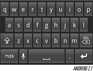
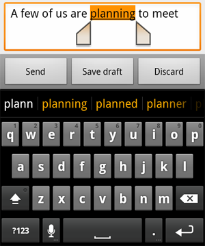
An on-screen keyboard. In retrospect, it's amazing to think that Google could've shipped Android without any sort of soft keyboard, but that's exactly what it did. It helps explain why the first Android device at retail was a landscape QWERTY slider, and it also explains why it wasn't until Cupcake was released (in April 2009, some half a year after the G1 shipped) that we saw the first touchscreen-only phone on the market, theHTC Magic.
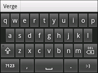
In conjunction with the soft keyboard support, Google took a bold step: it integrated the hooks necessary for third-party developers to create their own replacement keyboards, which is a capability that continues to differentiate Android from competing platforms even today — neither iOS nor Windows Phone support it. At the time of Cupcake's release, the official Android soft keyboard was considered by many to lag iOS for accuracy and speed, which ultimately led OEMs like HTC to quickly develop replacements on their own devices. Indeed, it was one of the first forms of "skinning" Android would see.
Extensible widgets. While Android 1.0 and 1.1 technically included widgets, their full potential had yet to be realized because Google hadn't exposed the SDK to developers — the only widgets you had available were the few included in the box. That changed in 1.5, and today, many (if not most) of the third-party applications on the platform ship with one or more widgets available to the user. It's a big deal for Android, which continues to enjoy the most flexible, extensible home screen of any mobile platform — and that title traces its roots to the addition of this feature in Cupcake.
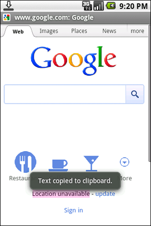
Clipboard improvements. Android had a rather rough road to gaining "full" support for copy and paste. The platform technically supported it from day one — but it was largely limited to text fields and links. That meant that text couldn't be copied out of browser windows or Gmail, two places where you're very likely to want to do it. Though full clipboard capability wouldn't come to Gmail for several more versions, Cupcake added support to the browser, allowing you to copy plain text out of a page.
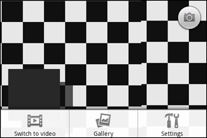
Video capture and playback. It's difficult to imagine a smartphone shipping without any support for shooting video now, but that's the situation that T-Mobile G1 buyers originally found themselves in. Cupcake would fix the problem, but like Android's built-in soft keyboard, the operating system's built-in camera interface became one of the more reviled parts of the platform — and it's a part that OEMs quickly replaced with their own improved interfaces, frequently adding support for additional scenes, modes, options, and conveniences like touch-to-focus.
And a lot more. Miscellaneous updates included batch operations in Gmail (you couldn't delete or archive multiple emails at once prior to 1.5), upload support for YouTube and Picasa, and ubiquitous access to contacts' Google Talk status throughout the platform in places like the Contacts screen, the Messaging application, and from Gmail. (In a way, this feature —synchronization of rich contact information across multiple apps and screens — would foretell the direction that Android was moving, particularly in 2.0.)
1.6 "Donut"
ANDROID 1.6 DONUT WAS A FAR BIGGER DEAL THAN ITS "0.1" INCREMENT WOULD LET ON
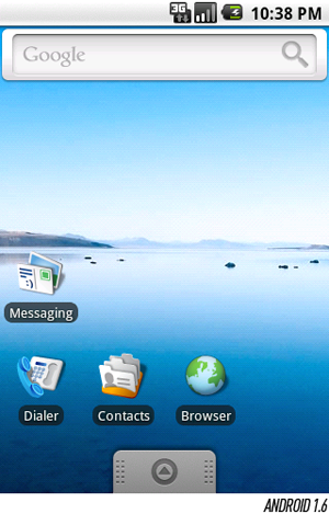
Though it wasn't as big of an upgrade as Cupcake, Android 1.6 Donut was still a far bigger deal than its "0.1" increment would let on. It made another pass of minor visual refinements throughout the platform and added a handful of new and updated, but much of the big news was under the hood. CDMA support was first offered in Donut, for instance, opening the door to American carriers like Verizon and potentially hundreds of millions of subscribers across Asia.
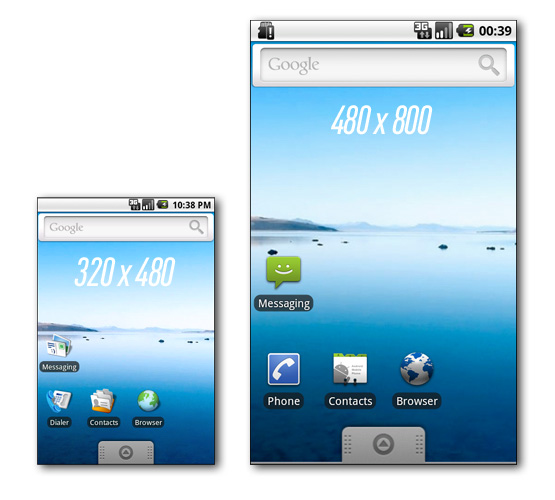
But perhaps none of the "under the hood" changes had a more profound effect on the platform than resolution independence. Donut marked the first time that Android was capable of running on a variety of screen resolutions and aspect ratios, which opened the door for phones that featured displays of something other than 320 x 480 in a portrait orientation. If you look at any carrier's Android lineup today, you're liable to see phones of QVGA, HVGA, WVGA, FWVGA, qHD, and 720p resolution — and maybe even a portrait QWERTY model or two — and that scaling capability traces its roots directly to 1.6.
PERHAPS NONE OF THE "UNDER THE HOOD" CHANGES HAD A MORE PROFOUND EFFECT ON THE PLATFORM THAN RESOLUTION INDEPENDENCE
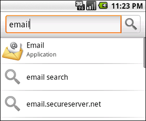
Donut also introduced the notion of the Quick Search Box, a concept more generally known in the mobile world as "universal search." Prior to Donut, pressing the Search button on an Android phone's keypad while on the home screen would take you to a Google search box for searching the internet, no different than navigating togoogle.com and typing your search there. With Donut's enhancements, you could search a variety of local content — applications, contacts, and so on — plus the internet all at once from a single box. What's more, Donut exposed functions for developers that allowed them to plug in so that their applications could be searched as well.
What other features debuted in Android 1.6? A redesigned Android Market — designed in the white and green accents so closely associated with Android's mascot — included some additional curation to expose lists of top free and paid apps, particularly important at a time when the platform's third-party app catalog was starting to explode. A redesigned camera interface was also included with better gallery integration and significantly reduced shutter lag, although it didn't garner any more critical acclaim than the one it replaced; Google would continue to make small changes to it through 2.3, though most users would never see it since manufacturers typically replaced it in their skins.
2.0 / 2.1 "Eclair"
"BIG" WOULD BE AN ACCURATE DESCRIPTION ALL AROUND

In early November of 2009 — about a year after the G1's premiere — Android 2.0 launched right on Donut's heels. "Big" would be an accurate description all around: it was a big deal, made big promises, and was deployed on big phones offered by big carriers. Eclair, as it was known, was initially offered exclusively on Verizon on none other than the Motorola Droid — the phone that kicked off one of the most successful mobile franchises in history.
What made Eclair so important? It represented the most fundamental refresh that Android had seen since its debut, both visually and architecturally. Of course, with an unheard-of 854 x 480 display, it didn't hurt that the Droid was by far the most powerful Android handset the world had seen at that point — but the significantly improved nuts and bolts of the platform played a big role in the device's retail success, too:
Multiple account support. For the first time, multiple Google accounts could be added to the same device — separate work and personal accounts, for instance — with access to email and contacts from each. Support for Exchange accounts was added, too.
Eclair also gave third parties the tools they needed to plug their own services into this account framework, which would then permit them to be automatically synchronized on an ongoing basis. One key advantage is that shared information between your account types can be automatically synchronized into a single contact on the phone, a one-stop shop for all the information about the individuals in your address book. Facebook was an early adopter of this functionality — in fact, it shipped on the Droid — but a spat with Google over where Facebook's synchronized contact information was ultimately stored ended with its account sync privileges being revoked.
Google Maps Navigation. This was a big one that continues to have an impact on the market even today. Released in conjunction with Android 2.0, Google Maps Navigation was a totally free turn-by-turn automotive navigation product using Google's own mapping data for guidance, and it included many of the features you'd expect to find on a typical in-car navigation system: a forward-looking 3D view, voice guidance (including street names), and traffic information. Considering that drivers had previously needed to choose between paying a significant amount of money for a turn-by-turn app, a monthly fee, or a dedicated navigation unit, Google's move was disruptive, to say the least. Early versions had some flaws that still made alternatives quite appealing - they required continuous internet access, for instance, and couldn't cache - but the system has been closing the gap ever since.
Quick Contact. Just as Cupcake had added contacts' Google Talk statuses throughout the platform, Eclair added the Quick Contact bar, which amounted to a pop-up toolbar that you could use to interact with contacts in a variety of ways — email, text, call, and so on. Wherever in the platform a contact's picture appeared, you could press and hold it to pull up the bar, which would spring into place with a neatly-designed row of icons. The bar was designed from the outset to be extensible, too, so as different types of information got synchronized to your contacts — Twitter handles, for instance - they could be added to the bar.
Soft keyboard improvements. Like the G1, the Droid launched with a full physical QWERTY arrangement, but Google still saw fit to use it as an opportunity to showcase a revised virtual keyboard. Although multitouch still wasn't fully supported throughout the platform — the Browser and Maps apps both lacked pinch-to-zoom, for instance — Eclair used multitouch data on the keyboard to detect secondary presses while typing rapidly, which can make a big difference in accuracy for fast typists.
Revamped browser. As mentioned earlier, Eclair's browser still didn't feature support for multitouch zooming, but it advanced in a number of other critical ways. Considering that Android 2.0 launched on a device with a capacious (for the time) WVGA display, it was critical that the Browser app be up to the task of displaying complex, desktop-optimized sites. To that end, Google added HTML5 support, including video (albeit only in full-screen mode). This was also the first time that Android's browser had a proper address bar, which Google had designed to mimic Chrome by doubling as a search bar. And to help alleviate the lack of multitouch, the new version added double-tap zooming — a convenient alternative to the zoom-in / zoom-out buttons.
There were countless other changes that touched nearly every screen in Eclair, too. Google continued its trend of warming over the UI in the latest version, but the changes generally felt more cohesive in 2.0 with cleaner, simpler icons and widgets designed to work well at the Droid's crisper resolution. Android 2.0 was essentially a lone wolf — outside of the Droid and its European equivalent, the Milestone, virtually every phone to launch after Eclair's release came with Android 2.1 instead, which did little more than fix a few bugs and add a small number of API capabilities. The telltale sign that it wasn't a big release? Google didn't grant it a new name - both 2.0 and 2.1 were known as Eclair. There were, however, a couple additions in 2.1 worth noting:
Live wallpapers. One of Android's quirkier features, live wallpapers first made an appearance in Android 2.1. The concept is simple enough: instead of a static image, the home screen's background is an actual application that can be animated and have some limited interaction with the user. Google itself demonstrated the power of the feature when it added a live wallpaper to a Google Maps update, which turned the home screen into an overhead map of the phone's current location - not particularly easy on battery drain, but a great conversation piece.
Speech-to-text. Google had been pushing the power of text-to-speech (TTS) since it added a developer framework for TTS engines in Donut, and now it was going the other direction - users could talk into their phones as a replacement for traditional keyboard input. To facilitate that, Android 2.1 replaced the comma key on the soft keyboard with a microphone; tap it, talk, and whichever text box you had highlighted would receive the dictation. And by all appearances, the capability isn't going anywhere - Apple added a similar feature to the keyboard in iOS 5.
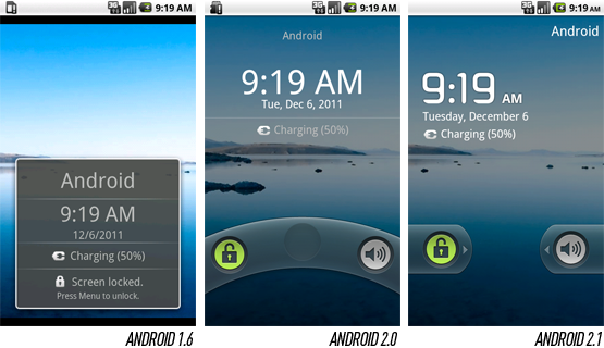
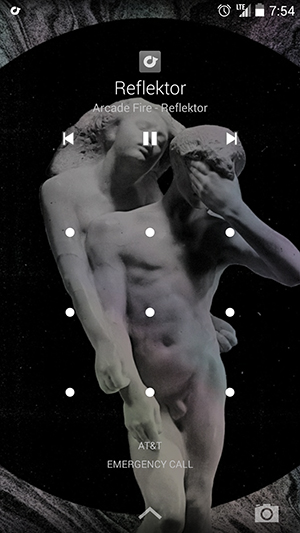
A new lock screen. Android 2.0 had actually included a new lock screen of its own that featured the ability to swipe the screen to unlock and change the phone's mute mode, but it was tweaked a second time in 2.1. The functionality remained largely the same this time, but Google changed the clock typeface from a standard sans serif to a distinctly more Android-esque, high-tech font and modified the unlock and mute functions to require a straight swipe rather than a curved one.
THOUGH IT WASN'T A HUGE UPDATE, ANDROID 2.1 MARKED A STRATEGIC SHIFT FOR GOOGLE
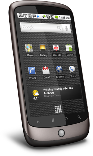
Though it wasn't a huge update, Android 2.1 marked a strategic shift for Google. Possibly concerned about its hardware partners' trend toward skinning and significantly altering the "stock" Android experience, Google chose to work directly with HTC to make its own flagship device — a phone that would showcase pure Android 2.1 without any modifications. Android the way Google intended, as it were. That's how the Nexus Onewas born, a slim, keyboardless device with one of the first 1GHz Qualcomm Snapdragon processors on the market and an advanced AMOLED display at WVGA resolution. It was well ahead of its time, and it has since gone down as one of the most well-regarded Android phones ever produced.
Google had actually started down this path in Android 2.0 with the Motorola Droid. Google and Moto had worked very closely together in the development of the phone, and the Droid received Eclair well before anyone else did, but it wasn't quite "pure" — the Droid made some user interface tweaks that don't appear in the stock builds of the platform — and Google never sold the Droid to users directly. That changed with the Nexus One.
2.2 "Froyo"
Android 2.2 was released in mid-2010, and the advantage of the Nexus program was starting to become clear: the Nexus One was the first to get updated. What did Google have to showcase in Froyo? Plenty. From the first power-on, the redesigned home screen was instantly recognizable: gone was the old three-panel view (which dated back to Android 1.0), replaced by a five-panel one with a new group of dedicated, translucent shortcuts at the bottom for the phone, web browser, and app launcher. Additionally, dots on either side of the shortcuts gave the user an indication of what panel they were currently viewing. In some ways, Google was playing catch-up here — third-party skins like HTC's Sense had already done all of these things.
Froyo also included a completely redesigned Gallery app that showcased the platform's 3D chops for the very first time: tilting the phone would cause the images to tilt on the screen, for instance, and it included a variety of high-quality animates when moving between individual galleries and photos. Really, though, the app was little more than a one-off, not an indication of Android's direction as a platform (Google had actually outsourced its development to an outside firm).
Other big features included mobile hotspot support — which many carriers would disable or provision at extra cost when selling their own Froyo devices — and better support for copy / paste in Gmail, patching one of the platform's bigger clipboard shortcomings. Google also added a traditional password / PIN lock screen for users who didn't like Android's unique pattern lock or required something more secure as part of their corporate policy. More generally, it was around the launch of 2.2 that it appeared Google intended to start taking Android seriously in enterprise environments where BlackBerry traditionally held an unbreakable stronghold, and a handful of Exchange-specific enhancements here helped drive that point home.
WHAT DID GOOGLE HAVE TO SHOWCASE IN FROYO? PLENTY

2.3 "Gingerbread"

About a half year after the launch of Froyo on the Nexus One, Google came back for another round of the Nexus program to support the release of Android 2.3. This time, it had selected Samsung to produce the Nexus S, a derivative of the company's wildly successful Galaxy S line. Though it actually wasn't much more advanced than the Nexus One it replaced, the two phones couldn't have looked much more different thanks largely to a new curved-glass display and a glossy, all-black shell. Gone also was the ubiquitous trackball beneath the display — with the Nexus S, it appeared that Google was finally ready to bid adieu to hardware navigation of the user interface. For Andy Rubin, the transition might have been a tough call to make: the trackball had always been a marquee feature in Danger's line of devices, and he'd brought it over for the G1.
Gingerbread was, in many ways, a relatively minor release — but there were enough "minor" changes to collectively make for a fairly large improvement in the platform. For one thing, it was the most significant reskinning of the platform since Eclair: stock widgets were refreshed (including the ubiquitous "Malmo" analog clock), the home screen's UI elements gained a hint of green, and the status bar was inverted so it had a black background with white text. This seemingly trivial change actually had a pretty big effect on the appearance of the platform — it instantly looked cleaner and more modern — but in reality, Google probably did it primarily to reduce battery drain and the effects of burn-in on AMOLED displays.
GOOGLE USED THE LAUNCH OF GINGERBREAD AS AN OPPORTUNITY TO GAIN SOME FOOTING IN THE MOBILE GAMING MARKET
Android 2.3 included a good mix of new functionality, too:
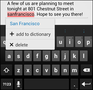
More granular control over copy and paste. Android's support for clipboard operations had been lagging iOS since Apple released version 3.0 in mid-2009, which offered a fantastic level of character-by-character highlight control using a magnifying glass to make the cursor easier to operate with a finger. Prior to Gingerbread, stock Android only offered the ability to copy the contents of entire text boxes, which was frequently (usually, even) not what you wanted to do. Gingerbread fixed this, adding word-by-word highlighting with finger-draggable anchors on either end to facilitate adjusting the highlight. As with the home screen improvements in Froyo, this was another area where Google was catching up to the innovations that some of its OEMs had already been including in their skins for some time — HTC had already grafted similar functionality into prior releases.
An improved keyboard. Google once again tweaked its stock keyboard for 2.3, and this time it was noticeable to the naked eye — the design and coloration of the keys changed significantly for the first time since the keyboard's introduction in Cupcake. Multitouch support also improved with "chording," allowing users to press multi-key combinations to quickly access the secondary symbol keyboard.
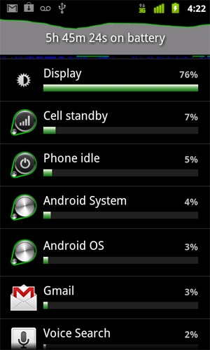
Better battery and app management tools. Android had been dinged by some for being too effective in supporting multitasking — by letting software run free in the background, battery life was always at risk of taking a big hit, particularly if a user had loaded poorly-designed apps. Gingerbread helped make that a little easier to fix with a new bundled utility for graphically viewing battery drain over time and seeing exactly what apps and system functions are eating the most power (of course, the onus was still on the user to uninstall offending apps or adjust their usage).
Support for front-facing cameras. Though it wouldn't be until mid-2010 that Google Talk would gain mobile video chat support, Gingerbread laid the groundwork for that functionality by supporting multiple cameras on a single device. Indeed, Google had the foresight to specify a front-facing camera on the Nexus S, though you couldn't use it for much other than taking pictures of yourself when the device first launched.
Other new features of Gingerbread were targeted more at developers than end users: NFC support, for one, which was available on the Nexus S by way of a special antenna embedded in the battery cover. For many months, this capability was little more than a novelty — you could scan Google Places signs in some cities to collect URLs with more information on the location, for instance, much as you would a QR code — but Google later used Sprint's version of the Nexus S to launch Google Wallet, a major mobile payment initiative. Many companies are betting the farm on the future of NFC and mobile payments, and Gingerbread was on the bleeding edge of that push.
Google also used the launch of Gingerbread as an opportunity to gain some footing in the mobile gaming market, an area where it had lagged iOS significantly. The new version gave developers lower-level access to audio, device controls, graphics, and storage, which allowed them to write considerably faster native code — absolutely key for creating the rich, graphics-intensive 3D games that the platform lacked.
3.x "Honeycomb"
HONEYCOMB WAS, TO SAY THE LEAST, AN ODDITY — DIVERGENCE IN GOOGLE'S HARD-CHARGING PATH TOWARD SMARTPHONE DOMINANCE
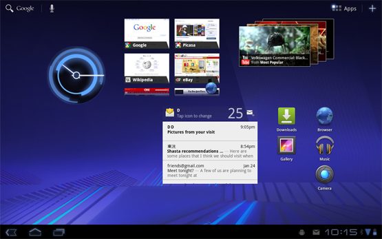
Honeycomb was, to say the least, an oddity — a divergence in Google's hard-charging path toward smartphone dominance. In fact, Honeycomb wasn't for smartphones at all. Instead, Google returned to Motorola — the company that it had worked with to deliver Android 2.0 exclusively on the Droid — to produce a device in the same vein as the Nexus series that would showcase "stock" Android 3.0, a variant of Android targeted exclusively at tablets. That device would become the Xoom.
Though Honeycomb hasn't seen the levels of market traction that Google was probably aiming for, it previewed a fundamental redesign of Android's user interface that would be more thoroughly built out in Android 4.0:
A move from green to blue accents. Green was, is, and likely forever will be associated with Android. The Android logo is bright green, of course, and Google's official Android site is covered in green accents. On the actual platform, though, green was shown the door with the release of Honeycomb. In its place, a light, desaturated blue was used for the battery and signal indicators, the clock widget, and a variety of highlights and trim pieces throughout the interface.
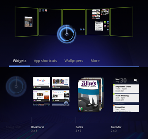
Redesigned home screen and widget placement. Rather than choosing home screen widgets from a list, sight unseen, Honeycomb ratcheted up the user friendliness a couple notches by showing visible previews for each type of widget available on the system — and once you choose your widget, you can place it on any of Honeycomb's five home screen panels from a single, zoomed-out view showing all five at once. Though Android had always used a grid for widget and icon placement on the home screen, Honeycomb did a better job of embracing it and exposing it to the user — below each widget preview, you can see exactly how many "grid squares" it'll consume once placed.
ANDROID 3.0 PREVIEWED A FUNDAMENTAL REDESIGN OF THE PLATFORM'S USER INTERFACE
The death of physical buttons. On a Honeycomb tablet, there's no need for dedicated, physical buttons for Back, Home, Menu, and Search as there had been on phones running 2.3 and below — instead, Back and Home have become virtual buttons that occupy a new "system bar" at the bottom of the screen. Because they're virtual, the operating system has the flexibility to show, hide, or change them when it makes sense to do so — and for hardware manufacturers, less bezel space needs to be devoted to supporting hardware buttons.
Improved multitasking. Borrowing a page out of webOS's playbook (keep in mind that webOS design guru Matias Duarte was employed by Google by the time Honeycomb was released), a new Recent Apps virtual button at the bottom of the screen produces a list of apps recently used — and more importantly, screen captures for each. On Gingerbread and prior, seeing recently-used apps involved a long-press of the Home key — something users would rarely think to do — and you were presented only with each app's icon, not a helpful thumbnail.
A new paradigm for app layout. Honeycomb introduced the concept of the "action bar," a permanently-placed bar at the top of each app that developers can use to show frequently-accessed options, context menus, and so on — it's something of a dedicated status bar for each individual application. Additionally, Honeycomb introduced support for multi-column app layouts, a nod toward the version's tight focus on tablets.
Android 3.1 and 3.2 were primarily maintenance releases (hence their continued use of the Honeycomb name), but they did produce a couple important features that have been retroactively deployed to most Android 3.0 tablets on the market. 3.1 added support for resizeable home screen widgets using anchors that appear when pressing and holding; a variety of third-party skins had supported widget resizing previously, but Android 3.1 pulled the functionality into the core platform.

4.0 "Ice Cream Sandwich"
ICE CREAM SANDWICH IS, WITHOUT QUESTION, THE BIGGEST CHANGE FOR ANDROID ON PHONES YET
And that leads us to our current state of affairs with the recent release of Android 4.0 on the Galaxy Nexus, a return to the Nexus program — and a second visit to Samsung, which had provided last year's Nexus S for the launch of Gingerbread. Ice Cream Sandwich is, without question, the biggest change for Android on phones yet — but many of its new features and design elements got their start in Honeycomb, including virtual buttons, the transition from green to blue accents, improved widget support, multitasking with a scrollable list of thumbnails, and "action bars" within applications.
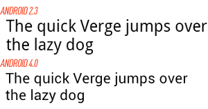
Longtime Android users are well acquainted with Droid, the custom-designed typeface that's been used since 1.0. Ice Cream Sandwich replaces it with another bespoke font — Roboto — that is said to be designed to take better advantage of today's higher-resolution displays, and Google has been keen to promote leading up to the version's release. Android design boss Matias Duarte noted that the old font "struggled to achieve both the openness and information density we wanted in Ice Cream Sandwich," whereas Roboto is said to avoid some anti-aliasing pitfalls ("grey mush," as he calls it) at any scale.
And one of Android's defining (and oldest) features saw a thorough refresh in 4.0, too. The aging notification screen is still one of the best implementations available in a mobile platform, but ICS improves it by making individual notifications removable simply by swiping them off the screen. In older versions, your only options were to clear them all — not always the desired behavior — or to acknowledge the notification in question by pressing it, which would usually send you into an application that you may not want to be in.
Google has quietly tweaked Android's soft keyboard in virtually every version since it launched in Cupcake, and ICS is no exception — in fact, it's as big of a leap forward as Gingerbread's was. The physical design and layout of the keys is largely unchanged, but the correction intelligence driving it has been overhauled, and real-world suggests that the changes are working wonders. Alongside, the platform gets an attractive implementation of inline spellcheck and replacement — not unlike iOS — with red underlining for misspelled words and on-the-spot dictionary adding. For the first time, text entry, clipboard support, and soft keyboard quality feel as though they're as good as anything on the market.
And that's just the start:
More home screen improvements. As we'd mentioned, ICS's home screen adopts many of the changes that Honeycomb brought into the fold, but it adds a couple new tricks, too. Folders can now be created simply by dragging one icon onto another, at which point they appear as a three-dimensional stack of icons rising out of a black circle — a nice look. The home screen also gets a "favorites tray," which mirrors the configurable dock functionality seen on third-party launchers and some OEM skins over the last couple years. Unlike Froyo and Gingerbread which had the Phone and Browser apps permanently docked to the bottom of the screen, the favorites tray lets the user decide what shortcuts should lie there (the defaults are Phone, People, Messaging, and Browser, but you can have whatever you like).
Android Beam. NFC support was heavily touted with the release of Gingerbread and the Nexus S — but apart from the limited rollout that Google Wallet has seen so far, there's been virtually no practical application to the capability whatsoever. ICS looks to change that with a new feature called Android Beam that allows two Beam-enabled phones to transfer data just by touching them together, and it's open — developers can extend it and use it however they see fit.
Face unlock. In addition to the pattern and password locks already supported, Android 4.0 adds a face unlock that uses the phone's front-facing camera to look for a match. It's arguably more of a novelty than anything else since it can be defeated with a picture of the individual who owns the phone — but for situations where only low to medium security are required, it's an interesting new option.
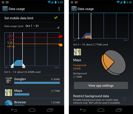
Data usage analysis. Just as Gingerbread improved visibility into battery usage by application, Android 4.0 does the same thing for data usage. You can see overall usage broken down by any time period you like (and set alerts to prevent overage), but additionally, you can drive down on an application-by-application basis and see what's eating your megabytes.
New calendar and mail apps. The Gmail and traditional email experiences on Android 4.0 have been extensively overhauled with new, crisper designs and "action bar" support — functionality carried over from Honeycomb. The calendar app has a unified view for the first time, convenient for those using multiple accounts on their device.
4.1 "Jelly Bean"
Announced at 2012's Google I/O conference, Android 4.1 Jelly Bean is arguably a much bigger deal than its mere 0.1 increment over Ice Cream Sandwich would have you believe. It represents both a reboot in Google's flagging tablet strategy (having been introduced alongside the Asus-sourced Nexus 7) and a big refinement in the completely redesigned user experience that debuted in Android 4.0.
A quick glance at 4.1 — starting with the home screen — doesn't give you much indication that anything has changed, but a deeper look reveals a host of tweaks and new features. And one of its most important features is under the hood, away from view: "Project Butter." Google says that it set out to significantly improve Android's visual and touch performance with this version by triple-buffering graphics, locking all drawing to a 16-millisecond refresh time, and making a number of tweaks to the touch input subsystem. Since Android's launch, the platform has always seemed to lag iOS's touch responsiveness by a hair (particularly when scrolling) and these changes help close the gap.
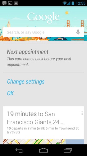
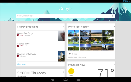
GOOGLE NOW IS A VERY BIG DEALOf all the user-facing changes, Google Now is undoubtedly the biggest, most important, and most ambitious. It's really an entire platform for Google — Jelly Bean just happens to be the first product to get it — and it seeks to do a lot of your day-to-day thinking for you, predicting what you need to know before you ask. Accessed with a screen swipe, Now processes a variety of data — your schedule, location, time of day, and so on — and presents a series of "cards" that slide into view depending on what it perceives as the most important information right this moment (it might give you a drive time home if it detects that you're at your office, for instance). It also integrates a revamped natural language search function with perhaps the most realistic text-to-speech system ever offered on a phone. With Jelly Bean, voice dictation is also available offline for the first time, meaning you don't need to be connected to a cellular or Wi-Fi network to use it.

Here's a small selection of 4.1's other headline features:
Roboto refresh. Android's signature font, first seen in Android 4.0, has been reworked. New styles and weights are used throughout the UI (italic is seen in Google Now, for instance) and the font renders a little differently than it did before.
Expandable, "actionable" notifications. Android has long had the best and most flexible notification system in the business (with webOS arguably the exception) and Android 4.1 takes it to the next level. Developers can now create more dynamic notifications that can expand right inside the notification drowdown to reveal more information and controls without opening the app itself. Notifications can also now be toggled off on an app-by-app basis, a useful feature first introduced by Apple with the debut of the Notification Center in iOS 5.
Widget flexibility. Resizable home screen widgets first came to the platform in Android 3.1, but Jelly Bean makes them more useful -— they can resize dynamically. The task of trying to fit all your widgets and icons on a single panel is a notoriously frustrating one, but now, widgets will adjust to fit the available space. Icons will also move out of the way to accommodate your drop target, much as they do in iOS.
Predictive text. Google has aggressively refreshed Android's stock keyboard with almost every new version of the platform (an effort that is largely lost because OEMs almost universally choose to replace it with their own), and 4.1 is no different. This time, focus has turned away from word correction and towards word prediction, a capability made famous by the widely popular SwiftKey and adopted by BlackBerry 10: the keyboard will now attempt to guess the next word that you want to write and adapt to your writing style over time.
AFTER HONEYCOMB'S FAILURE, A REVAMPED TABLET STRATEGY
4.2 "Jelly Bean"
HERE COME THE POINT UPDATES
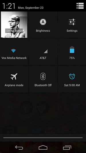
While Android 4.1 Jelly Bean introduced a new confectionary-based name and significant improvements over 4.0, Android 4.2 kept the Jelly Bean moniker and can be looked at as more of a refinement of the platform instead of a major update. Announced just six months after 4.1, 4.2 tightened up performance, introduced improved animations, and offered an even more cohesive design over 4.0 and 4.1. That isn’t to say there weren’t any user-facing additions: Android 4.2 offered a new control panel accessible from the notification shade (via a rather obscure two-finger gesture or a more obvious button), the ability to access widgets and launch the camera right from the lock screen, and the ability to trace words on the stock keyboard a la Swype.
One of the biggest additions to come with 4.2 was Miracast support, which lets you wirelessly stream video and audio from your device to a television or other display. Google’s apparent answer to Apple’s AirPlay, Miracast is considered an industry standard, and there are some set-top boxes on the market that support it. Unfortunately, there hasn’t been a lot of improvement in Miracast support since Android 4.2 was released in the fall of 2012, and there are relatively few smartphones on the market that take advantage of it, even if they have been updated to Android 4.2.
Though it wasn't a software feature, per se, Android 4.2 also saw the release of "Google Play edition" phones — popular devices from Samsung and HTC that had their custom software stripped and replaced with a "stock" Android experience. For customers who didn't love the Nexus hardware but still wanted to get Android 4.2 out of the box, the Google Play editions became the best option around.
Here’s a quick rundown of some of the other new features introduced with Android 4.2:
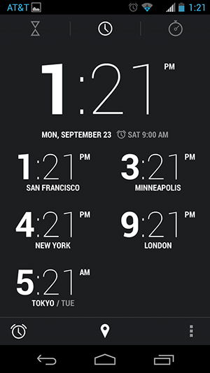
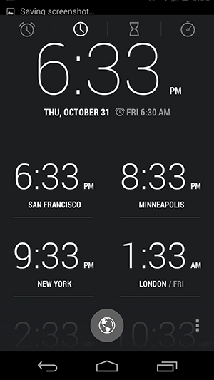
Redesigned clock app and clock widgets. One of the biggest visual changes in 4.2 is the new clock app, which features oddly-bolded hours and skinny minutes, as well as quick access to a countdown timer, stopwatch, and world clock. Google also added new analog and digital homescreen widgets to the clock app.
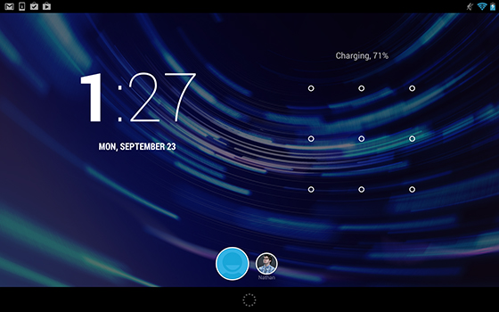
Multiple user profiles. Android 4.2 added the ability to have multiple user profiles or accounts on the same Android tablet, letting families easily share the same device. Profiles work very similarly to multiple user accounts in Windows or OS X, and are something that the iPad still doesn’t offer today.
Photospheres. Android 4.2 was the first time that Google introduced Photospheres to the world. A Photosphere is a 360-degree panoramic image that is captured by panning the device around to encapsulate the whole scene. Unfortunately, Photospheres are difficult to share — they can only really be shared through Google’s own Google+ social network — and were not the best at stitching many disparate images together. As a result, they’ve remained a novelty and aren’t something that most users bother with.
Daydream screensavers. As head of Android design, Matias Duarte influence on how Android looks and feels today is fairly significant, and the Daydream feature in Android 4.2 might be one of the most obvious of those. Daydream essentially replicates the Exhibition mode that came with webOS 2.0 (Duarte came to Google from Palm, where he led design on webOS), and is a screensaver that can display pictures, images, information, or widgets whenever the phone is plugged in or docked.
Accessibility enhancements. Android 4.2 added a number of improvements for the disabled, with the ability to triple-tap to magnify the entire screen, pan and zoom with two fingers, and speech output and Gesture Mode navigation for blind users.
4.3 "Jelly Bean"
Though we had been waiting for Android 5 for some time, Google threw us a curveball by once again sticking with Jelly Bean and a point update: Android 4.3 was announced alongside a new Nexus 7 on July 24th, 2013. As you might expect from the small jump in numbers, this update had an equally small jump in features. The most high-profile change to 4.3 was designed specifically with the Nexus 7 (and other Android tablets) in mind: improved multi-user support with restricted profiles, which put the tools were put in place to ensure kids didn’t go crazy with in-app purchases.
Google had begun making a big push for Android gaming earlier in the year, and with 4.3 the company began promoting it in earnest. The new version was the first operating system to support OpenGL ES 3.0 graphics, an advanced software engine for gaming. Apple followed suit with its own OS later in the year, though, and still maintains a significant edge in the gaming ecosystem.
Android 4.3 also brought some other minor improvements: TRIM support for improvement memory management, Bluetooth Smart for low-energy accessories, virtual surround sound, a predictive dial pad, and improved Wi-Fi location services.
For Android users, the relatively minor updates in 4.3 may have been blessings in disguise. For one thing, there was less consternation about the inevitable delays that every Android phone faces in getting the latest version of the OS. However, the biggest changes to the experience of using Android over 2013 didn’t come from OS updates, they came from app updates. As Android director of engineering Dave Burke explained to The Verge, Google has embarked on a process of modularizing Android. Many core apps like Gmail, Chrome, and Calendar get updated on a regular basis without the need for a giant OS refresh. That means that Android users get the benefits of those improved app right away, instead of having to wait for manufacturers and carriers to go through the long, slow process of customization and approval.
While Android 4.3 might be the pinnacle of Google’s new philosophy of making OS updates more about plumbing than about user-facing features, that doesn’t mean that users aren’t waiting for the next big thing. Google has already teased that the next version is coming — and it has a surprising name.
DESIGNED WITH GAMING AND THE NEXUS 7 IN MIND
4.4 "KitKat"
REFINING ANDROID FOR EVERYONE
Google released Android 4.4 KitKat in October 2013, coinciding with the launch of theNexus 5 smartphone. KitKat represents the first time that Google has partnered with an outside brand for the Android mascot, and the company has launched a massive marketing campaign with Nestle for it.
Despite being just a point update, 4.4 brings the largest visual change to the platform since the release of Android 4.0 Ice Cream Sandwich. Google has taken the visual concepts used in 4.1 and 4.2 and pushed them even further, and has modernized the platform in other places as well. The familiar blue accent color seen throughout versions 4.0-4.3 has been replaced with white, excising the last remnants of the Tron-inspired aesthetic introduced in Android 3.0 Honeycomb. Additionally, a number of stock apps have been redesigned with lighter color schemes.
But the biggest change is found in the home screen: Android 4.4 introduces a transparent notification bar and on-screen buttons; a refined, condensed version of the standard Roboto font; a new app drawer; and most importantly, Google Now integrated directly into the home screen.
KITKAT IS FASTER, MORE EFFICIENT, AND LESS RESOURCE INTENSIVEIn addition to the visual overhaul, Google says that "it's our goal with Android KitKat to make an amazing Android experience available for everybody." The company says it focused on making the new OS more efficient, faster, and less resource intensive. This allows it to run on lower-end and older hardware, which Google hopes will encourage manufacturers to update their existing devices and launch new devices with KitKat instead of resorting to older versions of Android. It’s Google’s biggest move yet to end the dreaded version fragmentation that has dogged the platform since its early days.
Here’s a look at some of the top features introduced with Android 4.4:
Google Now in the home screen. The biggest new feature for Android 4.4 KitKat is the redesigned launcher, and the star of that show is Google Now. The predictive search service has been pulled out of hiding behind a swipe up gesture (though you can still access it that way) and been given prime real estate as the leftmost page of the new launcher. Google Now’s features have also become more powerful — it can direct you to the right app for your search, instead of just launching a web search — and the pervasive search box at the top of every home screen is always listening for an "okay Google" voice command.
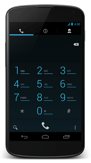
New dialer. The updated dialer now plugs into Google’s vast database of businesses and services, letting you search for things right from within the app and get results that might not be in your address book. The new dialer is a two-way street, too: if a business calls you and you don’t have its number stored, the dialer will identify the caller automatically. In addition to the new searching features, Android 4.4’s dialer has a new, lighter design that better matches the People app.
Full screen apps. Complementing the new transparent status bar and navigation buttons is the ability for apps to run completely full screen. Apps have the option to hide the status bar and navigation buttons entirely, providing a more immersive experience. The lock screen also offers full-screen album art and cover art for when you are listening to music and playing movies or TV shows on a Chromecast.
Unified Hangouts app. Android 4.4 expands Google’s Hangouts messaging service with the ability to send and receive SMS messages right from within the app. Though the new features are also available to earlier versions of Android, they made their debut with KitKat and the Nexus 5. The integrated SMS feature still needs a lot of work — Google doesn’t thread SMS messages in the same conversation as Hangouts messages — but it’s a big step towards Google making Hangouts the focus for all of your messaging activity.
Redesigned Clock and Downloads apps. For the second time since Android 4.2, Google has redesigned the standard clock app in KitKat. The new app offers a more intuitive interface for setting alarms, and does away with the odd bolded hours and thin minutes look of the earlier app. The Downloads app has also been redesigned with a lighter color scheme and more modern look and feel.
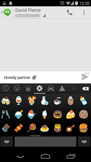
Emoji. With Android 4.4, Google has finally built colorful emoji characters into the standard keyboard. Other platforms and third party apps have long offered emoji, but now users have access to the various smiley faces and icons anywhere in the Android operating system.
Productivity enhancements. Google made productivity a big focus in Android 4.4, with a new version of the Quickoffice app and the ability to print to any printer connected to Google Cloud Print. The new Quickoffice users access to files stored on cloud services such as Dropbox, Box, and others, in addition to Google Drive. It also received the lighter design treatment, and fits in better with the rest of Google’s existing productivity apps. Google also updated its long-neglected standard email app (not Gmail) with better navigation, nested folders, and other improvements.
HDR+. On newer devices, such as the Nexus 5, Android 4.4 now supports HDR+, a new HDR mode that is said to provide sharper images with less noise and greater dynamic range. It still requires capturing multiple images and stitching them together, so it doesn’t work well with moving subjects, but it is impressive on landscapes and other still-life scenes.